These are some of the photos that I'm going to try and make into a book, I don't know whether to go down the factual or poetic route. It would be great to find a poem to typeset through the images, but that could be tricky...
Tuesday, 2 April 2013
Saturday, 2 March 2013
Museum of Bath at Work
Drawing out old typefaces from enamel signs to make new signs for the machines at the Museum of Bath at Work
CH3COOH + NaHCO3 explosions
This project has been about recording the reaction between vinegar and bicarbonate of soda in film canisters with watercolour ink. I think it's the kind of experiment that would go down well at schools and science fairs - you'd get to pick your colour and take the 'print' away with you. The second sheet with the text coming off the edges is perhaps more dramatic.
Monday, 18 February 2013
Saturday, 2 February 2013
Keith Hancox
Keith graduated from our course 5 years ago and came back to give a lecture about the kind of work he does for Mytton Williams, a design studio in Bath. This is my poster for his lecture, he is one half of Polar, an online shop that sells red and white things.
Friday, 25 January 2013
David McKendrick poster
I found the sketch I'd done during David's lecture and his shirt sleeves were down, so I felt I needed to change them on the poster - something wasn't quite right.
Monday, 14 January 2013
McKendrick Jumper
New poster in the works featuring David McKendrick's shirt + green jumper combo
Green came out mysteriously dark...
Sunday, 30 December 2012
Kate Bush
Kate Bush got a CBE! Well done Kate. Here's a terrible 20 minute sketch disguised by an even worse photo from my phone.
I've tried drawing her once before and it didn't go very well at all. I'm still very unfamiliar with her features.
Saturday, 29 December 2012
Friday, 28 December 2012
TWOCAN two
I managed to get back into the print room before Christmas, but not without three days of complete failure and the UV bulb blowing...
I wasn't very happy with the quality of the prints for the fundraiser but I didn't give myself much time to get them done, and I hadn't screenprinted properly for some time. The stencil washed off completely the first time I exposed the screen, and the second time the beak of the penguin fell out and it lacked the definition and detail in general that I wanted.
We have no full time technician so it's very hard to know what's making everything go wrong with no one to ask.
On the night all prints were being sold for £3, I put in an edition of 8 and all of them sold which was really nice - another reason why I wanted to print them again, to try and get them as close to what I'd hoped for in the first place, and that way I could sell them properly. If you're interested hit me up at lizziesh4rp@gmail.com. I'm going to maybe try and set up something on Etsy in the near future...
I also really wanted to try and do another colourway. I had florescent orange in my head a bit while I was drawing them, and I do like a bit of grey so I thought they went well together. Doesn't come over too well in photos but the orange really does pop.
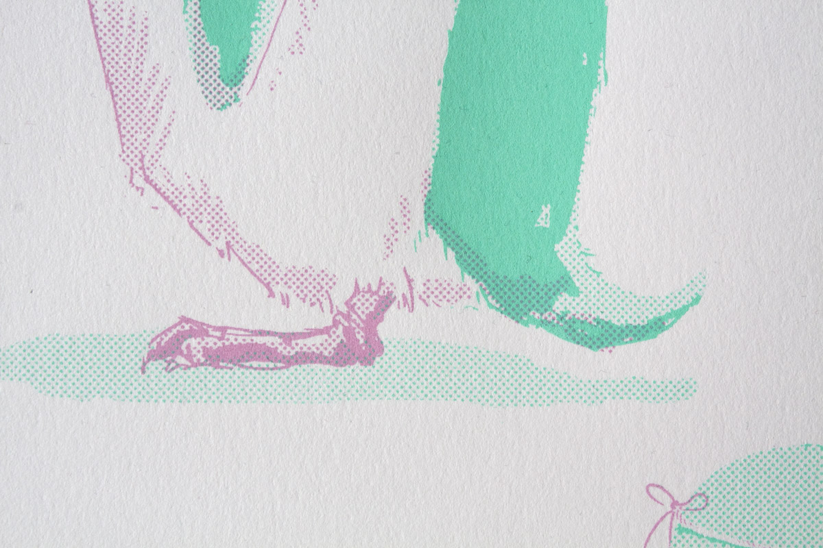
The detail came out much better - you can see the lines on the robin's leg and all the beaks are fairly consistent.
I had some baffling registration problems with the green/pink run, none of the second layers lined up properly despite them all being printed in the same place the first time... The grey/orange are much more consistent but that's part of the charm of (not being very good at) screenprinting... ha.
Subscribe to:
Comments (Atom)


